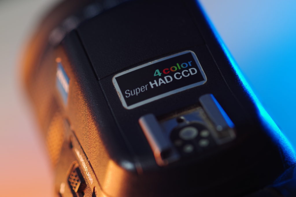
18 years ago in the early 2000s and early days of digital photography, a headline article appeared on the small but growing DPReview blog announcing an exciting new type of sensor. This sensor, made by the leader of digital sensors Sony, promised a more accurate color response by using a four color filter array rather than the traditional three color filter. Red green blue (RGB) color filter arrays were standard, but this new sensor added emerald to the list (RGBE).
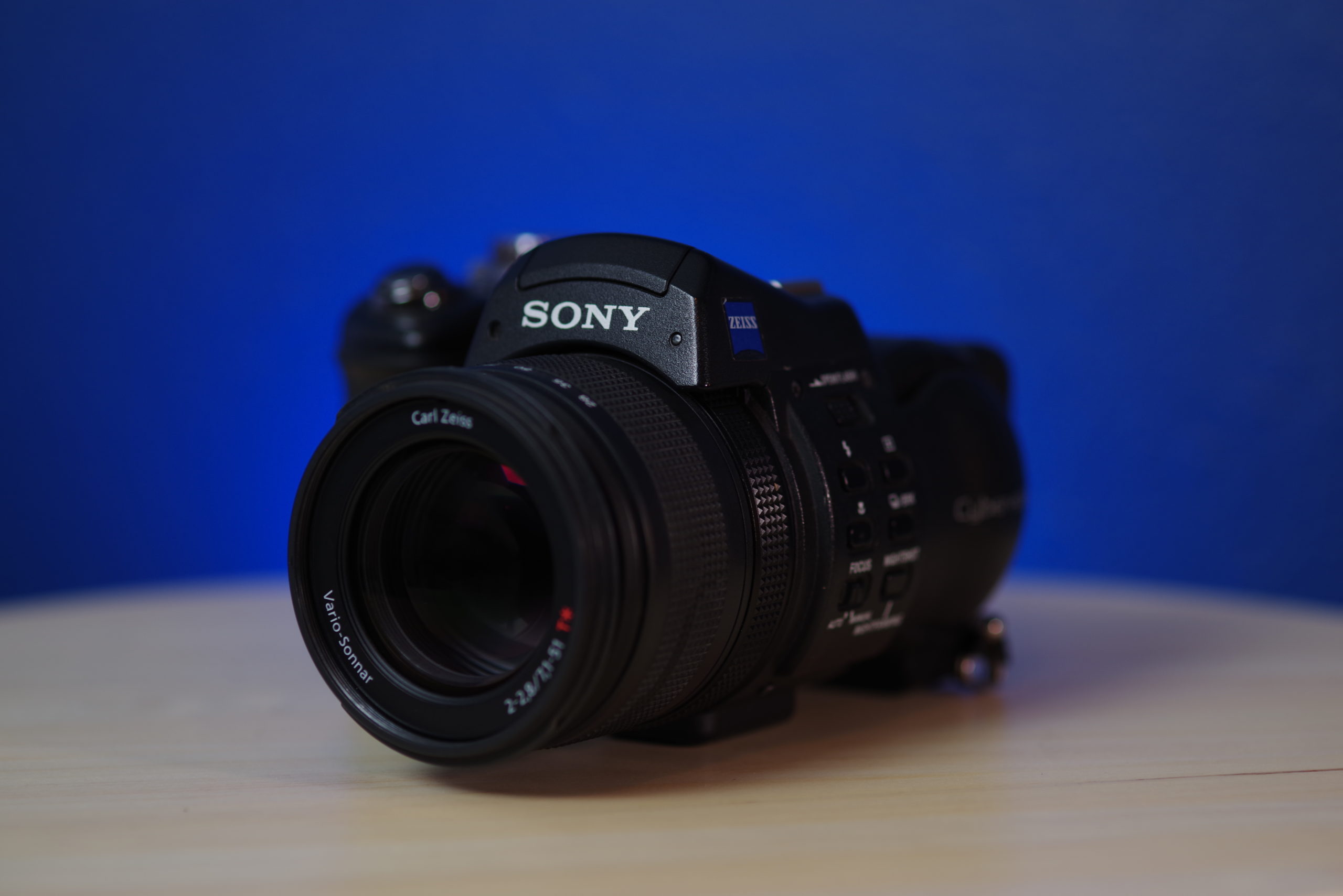
Sony F-828 – The Only RGBE Camera
Nearly twenty years later you are probably like me and had never heard of this type of sensor before, and thus can assume it did not prove successful for one reason or another. You would be correct in this assumption, but the reasons for this are not immediately clear.
I wanted to test this unique sensor out myself, so I recently picked up the Sony F-828: the one and only camera to be produced with an RGBE sensor. A special camera in and of itself, regardless of the sensor, the F-828 features the 8mp CCD RGBE sensor, a tilting body, and loads of high tech features for the day. It followed the critically successful Sony F-717, but failed to live up to the success of its predecessor.

Side-by-side RGB/RGBE Sensor Comparison
As part of my use of the camera I pitted it against my Canon Powershot Pro 1, an 8mp CCD fixed lens camera from the same era. The sensor is reportedly the same one as in the Sony F-828 just with a three color filter array instead of four. It seemed the closest way to see the difference in color response between an RGB and RGBE sensor, if there was any. The results are below. Please note that several factors can influence how an image appears on a digital camera. White balance, image processors, lenses among a few. But the results reflect what I have seen in the hundreds of other pictures I have taken with the Sony F-828.


‘Real’ vs ‘Standard’
The Sony F-828 offers two image modes – Real and Standard. Standard will appear closer to traditional sensors, but maintaining less color deviation than the competitors of the day. Real will offer even less. In common terms, the Standard mode looks higher contrast and closer to the colors of the Canon Powershot Pro 1, whereas the real mode looks lower contrast and with an orange cast. Real mode is what I used for the above comparisons, because it represents what the Sony F-828 was trying to accomplish – a different color response than any other camera sensor of the time.
Note: After publishing this article I found a little snippet in the original DPReview of this camera that may help clarify the Standard vs. Real modes. Basically it maps to a different color space.
Here is a comparison of Real vs Standard on the Sony F-828.


And here’s a comparison of the more typical appearing Standard mode from the Sony F-828 against the Canon Powershot Pro 1.


Conclusion
I’m not a scientist, let alone technical enough to understand all the factors behind the design and implementation of the RGBE color filter array. But as an artist, I can take a stab at why it did not succeed and was subsequently never released in another camera.
Looking at the results shows clearly that both the Real and Standard mode Sony F-828 images have a more brown/orange tint. This follows the original examples Sony shared at the release of the sensor. In some ways the images do look more accurate and true to life than the Canon Powershot images, which seem overly saturated. On the other hand, the greens appear to me too washed out and the blues to a lesser degree as well. Whether this is considered “better” or not is beyond my abilities to say, but certainly overall with images from the RGB sensor appear more visually appealing, generally. And I think this is what consumers found as well.
Was the relative failure of the RGBE sensor and Sony F-828 due to consumers not enjoying the images generally? Or, could it be that the hype Sony gave over the new sensor was doomed to fail no matter the results? I’m not sure we’ll ever know entirely. Let me know your thoughts of the comparison and images shared above. I think the images have a unique look that could be used creatively for some great shots, but it might not be for everyone, and not for all the time.
Happy snappin’
See more about the camera itself in my YouTube video with lots more sample images.


The most technically accurate colours are rarely the most pleasing, due to the memory colour effect. We prefer grass and foliage to be more cyan than yellow, skies more cyan than perfectly blue, bananas to be a bit more red than green… Canon in particular has been known to design their colour processing to lean more towards more pleasing, based on what people expect colours to be, than what they actually are.